Data Visualization
Data visualization is one of the hotter trends to hit business intelligence in the last couple of years. Its definitely something to consider adding into an existing implementation.
This concept usually involves taking existing data and "visualizing" it, or putting it into a form where trends and activity can be easily identified visually. This is usually different than a traditional dashboard, as the visualization can combine several variables, maps, and other widget type associations. Its gotten increasing popular on the web, where their often termed infographics. As a lot of the web 2.0 infrastructure has permeated software, its made its way into the BI world.
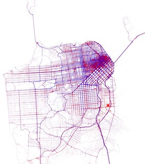
Here's a cool look at cab activity in San Francisco:

When done right, it can make a powerful statement about
the data, much more than a static report or line graph. Done wrong, and
it can run into many of the same criticisms of dashboards: too
confusing, ugly, or poorly designed.
Many software companies have popped up and had nice growth due to the new found popularity in the industry. The most popular include Tableau, Qlikview, and Tibco Spotfire. The major vendors have also moved quickly to address the need in the marketplace. Cognos has pushed out their Insight tool, Microstrategy has their new Visual Insight functionality, and SAS has been heavily marketing their new JMP tool.
Many organizations are still getting their feet wet with this concept, having a coupld of analysts dabbling in it. It still takes a back seat to enterprise reports, ad-hoc, and the basic BI functionality. Some companies may have a few licenses for one of the specialized tools for special project type work, or are cautiously exploring their vendors add-on functionality. As more and more companies expand out from traditional BI, I expect more usage and increased activity in this arena.
Learn more about Visualization Software
Go from Data Visualization to Home
Copyright 2011-2022 BusinessIntelligenceBase.com