Visual Mining
Visual Mining is an interesting tool. The name is a little bit of a misnomer, since its not really a data mining tool in the sense of R, SPSS, or SAS. The focus here is more on dashboards.
Their technology is based on Java and the charting is HTML5 compliant. Their main strengths appear to be on the charting and graphics vs. more reporting. The developer versions are geared toward integration into other web-based applications. Basic reports can be created but the biggest power with this tool is the graphics side. They emphasize the ability to export into multiple formats, especially graphics files.

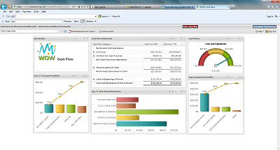
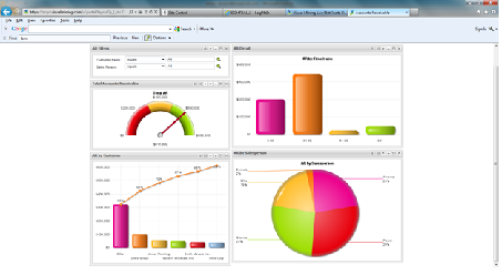
The basic Netcharts interface is pretty clean and user friendly. They have the standard bar and line charts along with gauges. Here’s a couple of screen shots of some demo dashboards. They are heavy on the four quadrant methodology of visualizing data, which isn’t bad necessarily but is a basic technique.

The multi-source option is strong functionality. Bigger BI vendors have only recently added this type, Microstrategy for example, only made it an option with version 9. It’s good for pulling in from disparate data sources that can’t be consolidated. They have a mobile option, but it’s based off of their standard web dashboard system without a lot of built in iPad functionality on top of it.
Another interesting point is the money-back guarantee for consulting. They promise a full dashboard implementation within 10 days, or your money back. It speaks to the quick runup time and easy of use of the implementation.
They have a strong lineup of customer success stories, including IBM Global Services. Interesting that they weren’t using Cognos, although for that particular piece it was using a specific tool that generates gif files for reports. It’s also embedded as part of Hyperion’s chart tool in the Hyperion Reports area, although that has been reworked somewhat after the recent acquisition by Oracle.
Copyright 2011-2022 BusinessIntelligenceBase.com